Panthers Change Logo
Added on Jan 30, 2012 by Scott in

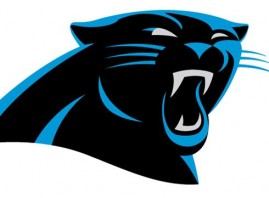
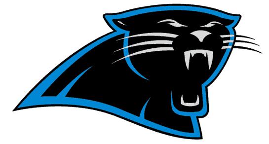
Blink and you might miss it. The Carolina Panthers have made some alterations to their team logo. The black and teal panther has been updated to be “more aggressive” and “three-dimensional” to help usher in what the franchise hopes is a new era of winning with phenom Cam Newton under center. It marks the first significant change to the logo since their inception in 1995.
The transition to the new and improved look will occur throughout the 2012 season.
“We have one of the finest and most recognizable logos in the NFL and wanted to make it as modern as possible without losing the dramatic essence of the mark,” said Carolina Panthers President Danny Morrison. “It is a cleaner style that is easier to read and should be more applicable to different uses.”
Look closely at the eyebrows and teeth to see the differences. The furled brow and more pronounced fangs are meant to represent a tougher, meaner persona. Also gone are the white nose and whiskers, which are now a darker shade of teal, as evidenced by this pic of the old logo.
 In addition to the art, the actual logotype has been updated to reflect the modernized branding and will feature a claw swipe on the “A” in Panthers. It was “inspired by the swift, sleek nature of a panther.” Now all they need to do is get rid of the all-white Plain Jane uniforms to complete the makeover.
The Panthers will likely be a trendy pick next season to make some noise. A year after finishing a league worst 2-14, they showed vast improvement by going 6-10 in 2011. With Newton at quarterback, the offense finished 5th in scoring and third in rushing. He set eight rookie records and his fourteen rushing touchdowns set a single season record for quarterbacks. He also earned a trip to the Pro Bowl as a replacement for Eli Manning.
Source; ESPN.com


